


Hi,
My
name is Don Hutcheson and I’m one of the world's few truly independent color management consultants.
I develop, install and train ICC and G7+ solutions for agencies, brands, photographers, separators, printers,
publishers, video, cinema - anyone who needs accurate color. Over five decades of digital imaging combined with
a love of science and photography help me bridge the
gap between conventional and modern methods, and solve the most challenging problems. Above all, I like to show how easy and fun the otherwise confusing subject of color management can be.
I'm available to set up your own system
or you can come to a G7+ Expert training course, hosted by PRINTING United Alliance. You can also hear
me preach the ICC and G7+ gospels at trade shows, industry meetings and better brew pubs.
Background
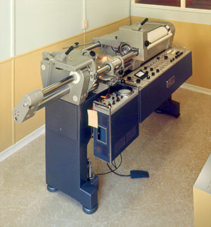
I learned pre-press color separation through a 5 year apprenticeship at
Photengravers Ltd., Auckland, where I operated one of the first two scanners
in New Zealand - a Hell C296 Vario-Cromograph. It made four continuous-tone films at a blazing 25 minutes
per color, which then had to be screened on an enlarger.
In the late 1970s I worked my way through England, Europe and Iraq (complete with near-death adventures) before coming to the USA in 1979 with
Linotype-Paul Scanner Division (later RZ, then ICG).
In 1988 I joined Crosfield Electronics ending up in DuPont's Core
Technology group working on Digital Waterproof and HiFi color.
I am basically a geek. I love to push technology beyond its
intended use and I think laziness is the mother of invention. Not that
I object to hard work - it's just that I hate wasted effort. If there's a
better, easier, cheaper way of doing something, I like to find it. That's
why I love color management. That's how I invented G7.
Discovering RGB
When I saw my first color scanner in 1968, I immediately realized its
potential for pure photography, making pin-registered RGB separation negatives with trial-and-error color edits, then printing them additively onto color paper and slide film. At the time, the results were mind-blowing, with un-heard-of sharpness, tonal accuracy and color fidelity, but the cost was prohibitive for commercial photography
As soon as ICC profiles and Photoshop became available in the mid 1990s, I pioneered RGB workflows for photographers, photolabs, publishers, pre-press and video users. To find out why RGB is the most practical workflow, even if the end result is printed in CMYK, download my RGB_Arguments.
Soft proofing
From my first day of scanning back in 1968 I was dismayed by the awkward
user interface. How was I supposed to visualize the end result just by numbers
on a dial? Why couldn't I see the effect of each control move on a color TV?. (Silly idea.)
In the 1980s I installed hundreds of color scanners
in USA Today and other newspapers, where the average color experience was
nil. To simplify training and operation I persuaded the brilliant Peter Nielson (RIP), ITEK's R&D Director, to build
a video monitor that displayed a quick pre-scan, showing the operator what we now call a "soft proof". The monitor could simulate any press, turning scanner operation into a visual
process, infinitely easier and faster than before. For this ITEK won
the coveted Queens Award to Industry.
To make it easier to compare the monitor to an actual proof
I persuaded Fred McCurdy (RIP) at GTI to build a dimmable D-50 viewing booth that sits alongside the monitor. He
said he'd never sell more than one but today it's a best-seller and absolutely essential for effective
soft proofing. To see how it's used, download my Soft
Proofing Tips.
HiFi
Color - making lithography more like photography
A passionate love of photography lured me into this industry, but
when I saw my own photographs printed by offset, I was appalled.
What happened to the reds? I asked. But the old-time journeymen
couldnt tell me why my saturated Kodachrome colours looked so drab on press. I soon discovered it was a simple lack of ink
saturation and began a life-long quest for richer, more colorful printing.
In 1983 I developed an automated touch plate system (with $9 worth
of Radio Shack parts) called the "5th Color Control", which dramatically
improved deeply-saturated colors. Later I persuaded DuPont
to develop HyperColor, which did the same thing in software. To imitate the HyperColor effect using a 4-color ICC profile, download my HiFi_notes.
How I got hooked on color management
When Apples ColorSync 2.0 made automated color management viable in 1995, the first profiling software was awful, but I knew one day it would revolutionize the prepress world. So I formed Hutcheson Consulting (now HutchColor) to help traditional users take advantage of this new technology, working with pioneers Franz Herbert & Dan Caldwell (then ColorBlind, now Chameleo and Remote Director) till their software was as good as any high-end drum scanner. Then I took it to real-world printers, publishers and separators to see if they could break it. At first color management was met with skepticism and fear, especially by traditional pre-press separators, but today it is universally accepted and indispensible.
My involvement with print standards
One of the eternal frustrations amongst publishers, agencies, and other print buyers, is the uncertainty about what a job will look like when it hits the press. The proof is one thing, but will the press match it? This frustration translates into less efficient printing and higher print buyer costs, as the printer tries to 'chase the proof' to satisfy the client.
The root problem, until 2006, was the lack of a true 'standard' of how a good press sheet should look. True, the US printing industry had SWOP (Specifications for Web Offset Publications) and GRACoL (General Requirements and Applications for Commercial Offset Lithography), but these were only 'specifications' with tolerances too loose for a precise visual match. Even the official ISO 12647 printing standard (on which SWOP and GRACoL are based) failed to define printed "appearance" adequately for ICC-savvy users.
Without a standard of press appearance, there was no stable target for a press or proofing system to imitate. Conventional proofing systems like KPG MatchPrint, Fuji ColorArt, Agfa PressMatch and DuPont WaterProof all made beautiful presentation prints, but they (a) didn't match each other, and (b) only approximated the appearance of a particular press. With the advent of ICC color management, however, any proofing system could be made to match virtually any 'target' press, but the question remained, what should that target be?
In 2003 three major New York ad agencies asked me to define that very target. What they wanted was a precise visual definition of 'standard appearance' for commercial offset proofing and printing. Foote-Cone-Belding (later DRAFTFCB) funded some research and in partnership with three local printers, Sandy Alexander, AGT and Applied Printing Technologies, we started an unofficial testing group, irreverently called The Manhattan Project, to create a set of 'print appearance' standards with less ambiguity than the GRACoL and SWOP specifications.
Our first test simulated TR001 (US Web Coated SWOP) proofs at all four sites using a custom calibration method I'd developed years before called "Press2Proof" (P2P) that differed considerably from traditional dot-gain (TVI) calibration. All the proofs matched very closely, and the group quickly approved TR001 as a visual standard for publication proofing and printing. But when we tried to match GRACoL's tentative DTR004 data, the results fell far short of good commercial printing, so Mike Graff at Sandy Alexander hosted a trial press run to see if we could come up with better data.
To avoid conflicting standards, we invited the GRACoL committee to participate for a combined Manhattan Project/ GRACoL press run. A key goal was to test my P2P method (now known by the PRINTING United Alliance tradename G7®). The Sandy run showed that P2P calibration controlled visual appearance much better than legacy TVI calibration, and the two projects were merged into one.
In 2005 and 2006 GRACoL conducted additional press runs at nine commercial printers across the USA, the average of which produced an unambiguous description of how good CtP (Computer-to-Plate) commercial printing appears on a number 1 coated sheet with ISO-standard inks but 'uncalibrated' plates.
The SWOP committee quickly adopted the same approach, and the result was three new "CRPs" (Characterized Reference Print Conditions) - GRACoL2006_Coated1, SWOP2006_Coated3 and SWOP2006_Coated5 - that represent good CtP-based printing on coated number 1, 3, and 5 sheets. These three CRPs have a common G7 'backbone' giving them a "shared neutral appearance" (similar gray balance and tonality), with ISO 12647 ink and paper colors, which means that when ICC conversion is impractical, a CMYK file created for one press but printed on another (by accident or design) should look as close as possible to the original intent WITHOUT plate curve edits.
If all US and foreign prining standards shared this simple concept, it would simplify, improve and reduce the cost of file exchange between different printing systems commercial, publication, newsprint, flexo, ink-jet, etc., no matter where the work was printed. In the past this goal was impractical due to the differences between negative and positive film-based plates, screening methods, ink colors, etc., but thanks to today's universal CtP plate-making, digital proofing and ubiquitous calibration curves, virtually any CMYK imaging device can be 'forced' to a common standard of gray balance and tonality, greatly simplifying print production and print buying.
The challenges of print standardization are not trivial, given the enormous number of variables in offset and other printing methods and the necessarily cautious process of writing an ISO standard. But as one of the few industries on Earth without efficient, universal standards, any effort to define a universally-accepted specification of 'print appearance' is a vital step towards improving quality and efficiency for everyone.
To learn more about SWOP, GRACoL, or G7+, go to https://printing.org. Better still, join PRINTING United Alliance. The work we are doing today will benefit everyone, but it also has to stand the test of time. The more individuals and companies involved at this stage, the better.